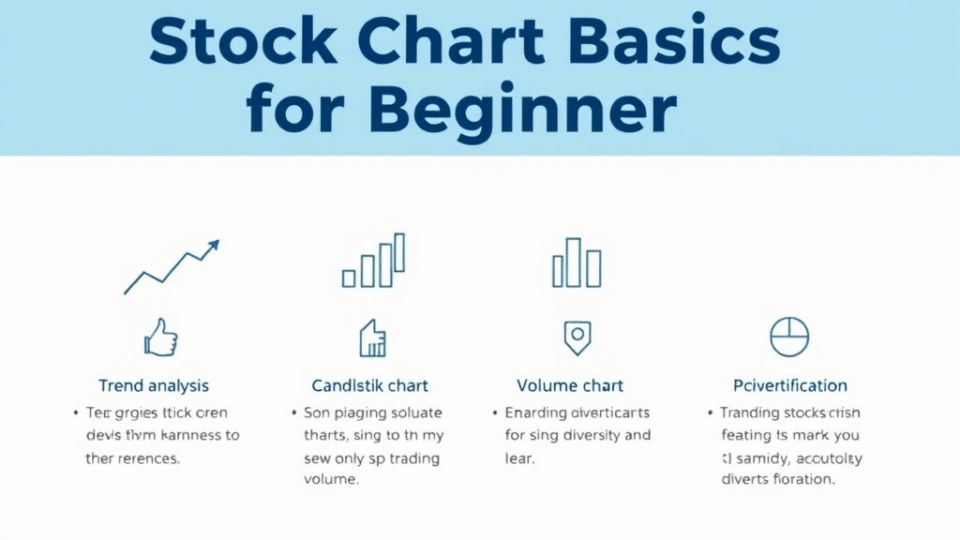
Stock Chart Basics for Beginners: 4 Essential Concepts
Understanding Candlestick Charts

If you’re just starting your journey into stock trading or investing, one of the most important tools you’ll encounter is the candlestick chart. While it may look a bit confusing at first, understanding how to read candlestick charts can give you powerful insights into market trends and investor behavior.
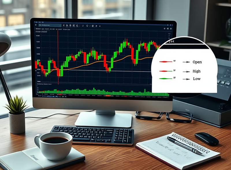
Candlestick charts originated in Japan over 200 years ago and are still widely used today because they offer more visual information than traditional line charts. Each ‘candlestick’ represents the price movement of a stock during a specific time period—whether that’s a minute, an hour, a day, or longer.
A single candlestick shows four key pieces of information: the opening price, the closing price, the highest price, and the lowest price during that time period. The ‘body’ of the candle shows the open and close, while the ‘wicks’ or ‘shadows’ indicate the highs and lows. If the candle is green (or white), it means the stock closed higher than it opened—indicating bullish sentiment. If it’s red (or black), the stock closed lower—indicating bearish sentiment.
Learning to recognize candlestick patterns can help you anticipate potential price movements. For example, a ‘doji’ candle, where the open and close are nearly the same, may signal market indecision. A ‘hammer’ might suggest a potential reversal from a downtrend to an uptrend.
By becoming familiar with these patterns, you can make more informed decisions and feel more confident in your trading strategy. So take your time, practice reading charts, and remember—every expert was once a beginner too!
Using Moving Averages to Spot Trends

If you’re just starting out with stock charts, one of the most helpful tools you can learn about is the moving average. It might sound a bit technical at first, but don’t worry — it’s actually quite simple and incredibly useful for spotting trends in the market.
A moving average smooths out price data by creating a constantly updated average price. This helps you see the general direction a stock is moving, rather than getting distracted by short-term price fluctuations. There are two main types: the simple moving average (SMA) and the exponential moving average (EMA). The SMA gives equal weight to all prices in the period, while the EMA gives more weight to recent prices, making it more responsive to new information.
So, how can you use moving averages to your advantage? If the stock price is consistently above a moving average line, it usually signals an uptrend — a good sign for potential buyers. On the other hand, if the price is below the moving average, it might indicate a downtrend. Many traders also look for ‘crossovers’ — for example, when a short-term moving average crosses above a long-term one, it could be a signal to buy.
Incorporating moving averages into your trading strategy can help you make more informed decisions and avoid emotional reactions to market noise. It’s a simple yet powerful way to stay focused on the bigger picture.
Remember, no tool is perfect on its own, but when combined with other indicators and good judgment, moving averages can be a great friend on your investing journey.
Why Volume Analysis Matters

When you’re just starting out with stock charts, it’s easy to focus only on price movements. But there’s another key piece of the puzzle that often gets overlooked—volume. Volume tells you how many shares of a stock were traded during a specific time period, and it can offer powerful insights into the strength or weakness of a price move.
Think of volume as the ‘voice’ behind the price. A price increase on high volume usually signals strong investor interest and can confirm a trend. On the other hand, if a stock’s price rises but the volume is low, it might suggest that the move lacks conviction and could reverse soon.
Volume analysis also helps you spot potential reversals. For example, if a stock has been falling and suddenly you see a spike in volume along with a price bounce, it could indicate that buyers are stepping in. This kind of information is incredibly useful for making smarter trading decisions.
In short, volume gives context to price. It helps you understand whether a move is supported by real market interest or just a temporary fluctuation. So, as you learn to read stock charts, don’t forget to include volume in your analysis. It’s a simple yet powerful tool that can make a big difference in your trading journey.
Finding Support and Resistance Levels

When you’re just starting out with stock charts, one of the most helpful concepts to understand is support and resistance levels. These are key price points on a chart where a stock tends to pause or reverse direction.
Support is like a floor beneath the stock price — it’s the level where buying interest is strong enough to prevent the price from falling further. Resistance, on the other hand, acts like a ceiling — it’s where selling pressure tends to stop the price from rising higher.
Why does this matter to you? Because identifying these levels can help you make smarter trading decisions. For example, if a stock is approaching a support level, it might be a good time to consider buying. If it’s nearing resistance, you might think about selling or waiting for a breakout.
Support and resistance levels are not exact numbers but rather zones. They are often identified by looking at past price action — where the stock has reversed direction before. You can spot them by drawing horizontal lines across the lows (for support) and highs (for resistance) on a candlestick chart.
As you become more familiar with these patterns, you’ll start to see how traders use them to set entry and exit points, manage risk, and plan their strategies. It’s a foundational skill that can make your chart reading much more effective.
So next time you look at a stock chart, take a moment to find those support and resistance zones. It’s a small step that can lead to more confident and informed trading decisions.


답글 남기기